The Colour-Mood Shortcut: Why One Hue Cannot Dictate a Feeling
Colour mood depends on context, not a fixed code. Learn to read surrounding hues, subject matter and image choices before deciding how a picture feels.
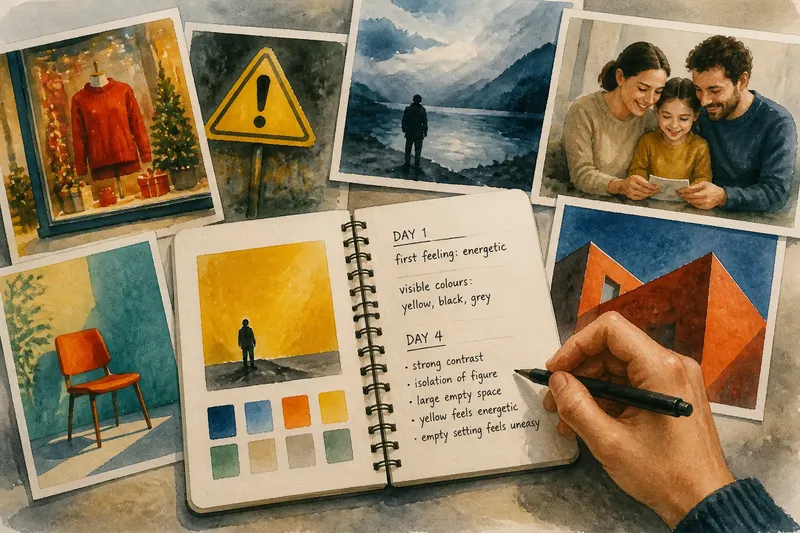
A red jumper can feel festive in a shop window, alarming beside a warning symbol, or quietly ordinary in a family photograph. Colour mood depends on context: the hue is only one part of the image, and its neighbours, subject and purpose help shape what viewers read into it.
To see this for yourself, keep a short colour-reading routine over a week. Each day, look closely at one image you encounter and note what you think its colours are doing before asking what else might have led you to that feeling. The aim is not to replace one colour code with another, but to become more precise about how an image guides interpretation.
Why does colour mood change from image to image?
A hue is a family of colours, not a single emotional instruction. A muted blue-grey, a bright cyan and a deep navy may all be called blue, yet differ in brightness, saturation and association. Saturation describes how vivid or subdued a colour appears; value describes how light or dark it is.
Interpretation also depends on what the image depicts. A saturated green in a packet of garden seeds may suggest growth, while the same green on a person’s face in a stylised portrait could seem unnatural or uneasy. Neither reading comes from green alone.
Culture and personal experience add further layers. A colour may recall a team, a school, a ceremony or a familiar place. Those associations can influence a viewer, but they are not universal rules, and they may be overridden by the image’s other cues.
What should you notice before naming a feeling?
Start by separating observation from interpretation. “The background is dark blue and the coat is orange” describes visible choices; “the scene feels lonely” describes a response. Keeping those statements apart makes it easier to ask which parts of the image support that response.
- Hue: Which colour families are present, and which one draws the eye first?
- Value: Are the important areas light, dark or close in brightness?
- Saturation: Do colours look vivid, dusty, pale or almost neutral?
- Relationships: Do neighbouring colours contrast sharply or blend together?
- Subject and setting: What is shown, and what expectations does that subject bring?
- Image treatment: Does the photograph look naturalistic, tinted, theatrical or heavily edited?
These are prompts, not a scoring system. A cool palette may contribute to distance, for instance, but a close crop, a direct gaze or a familiar domestic object can pull the viewer towards intimacy instead.
How can you practise reading colour over a week?
Choose one image each day: a photograph in a magazine, a poster on a noticeboard, a film still or a picture in an online shop. Spend a few minutes with it, using a notebook or the Notes app to record what you see and what you infer. Pick images with different purposes so you do not confuse a design convention with a universal response.
- Day one: Write down the first feeling the image suggests, then list the visible colours without explaining them.
- Day two: Look at the same image again. Identify the most prominent hue and the area that attracts your attention; ask whether placement or contrast may matter as much as the hue itself.
- Day three: Find a second image using a similar dominant colour. Compare its subject, setting and treatment with the first, then note where your reactions differ.
- Day four: Examine the colours beside the dominant hue. Consider whether contrast, repetition or a small accent changes the mood you initially named.
- Day five: Look at an image with the colour in a different role: a small detail rather than a background, or an object rather than clothing. Notice whether its meaning shifts with its function.
- Day six: Describe the image to someone else without naming an emotion. Ask what mood they infer, then compare the visual details each of you noticed; a difference is a prompt for closer reading, not a wrong answer.
- Day seven: Revisit your first note. Rewrite it as a more specific observation, such as “the dark blue background and isolated figure make the scene feel distant to me”.
Say you choose a poster with a vivid yellow background and a small black figure. Your first note might be “yellow feels cheerful”. On a later look, you notice the figure’s isolation and the stark contrast; a more careful reading could be that the colour feels energetic while the empty setting feels uneasy. That is a plausible interpretation, not a rule that every viewer must share.
What changes when you compare colours in context?
Comparison reveals that colour relationships often carry more weight than colour names. Complementary colours—those opposite one another on a colour wheel, such as blue and orange—can create strong contrast. That contrast may make a subject stand out, but it does not decide whether the scene feels lively, tense or calm; the subject and composition still matter.
Nearby colours can also alter how a hue appears. A pale grey beside white may look darker than the same grey beside charcoal. In an image, this means a colour’s apparent character is partly relational: inspect its neighbours before assigning it a mood.
Pay attention to how much of the image each colour occupies. A small red detail can become a focal point against a restrained palette, while a broad field of red may feel enveloping or merely decorative. Placement, scale and contrast help explain why the same hue can have different visual force.
Which questions help when colour seems to set the mood?
Does blue always make an image feel calm?
No. Blue can feel restful in a softly lit landscape, but a sharp electric blue in a graphic design may feel forceful, and a cold blue cast can make a room appear distant. Look at its brightness, saturation, neighbours and subject before deciding what it contributes.
Can one accent colour change the whole image?
It can strongly redirect attention, especially when it contrasts with a quieter palette. Its effect still depends on what the accent marks: a bright detail on a celebratory object and the same detail on a warning sign invite different readings.
How should you describe a colour response you cannot explain?
Begin with a personal, qualified statement: “This combination feels tense to me.” Then name visible features—perhaps a high contrast, a dark value range or an unexpected colour on the subject—that might support your response without claiming they dictate it.
Should an image-maker follow familiar colour associations?
Familiar associations can be useful if they fit the image’s purpose, but they are not instructions. An image-maker can test a palette against the subject, audience and intended emphasis, then decide whether a convention clarifies the idea or makes it feel too predictable.
How can you use this reading in your own images?
When choosing colours for a photograph or illustration, make a small palette and consider each colour’s role: background, subject, accent or shadow. A tool such as Adobe Color can help you view relationships on a colour wheel, while a simple paper sketch lets you judge whether the main subject remains easy to notice. Neither tool can predict a viewer’s feeling; they help you inspect the choices.
If an image feels wrong, change one element at a time. You might soften a highly saturated background, shift a nearby colour or reduce a distracting accent, then look again at the whole composition. For a photograph, editing controls in Lightroom or a phone’s built-in editor can adjust colour and tone; keep an untouched copy so the original remains available for comparison.
Return to your week of notes when you meet a new image. Instead of asking what a colour means, ask what this colour is doing here, beside these other colours, in this subject and setting. That question turns colour mood from a shortcut into a careful way of seeing.