Why Empty Space Can Make a Subject Feel Present
Learn how empty space in composition can direct attention, shape a subject’s presence and help you make deliberate choices when framing an image.
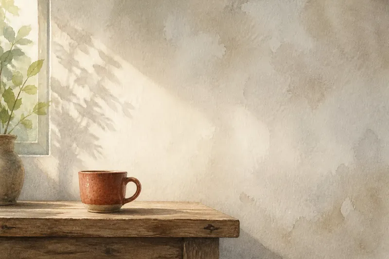
You frame a ceramic cup against a blank kitchen wall, but it looks oddly small; shift it towards one edge and the wall seems to gather around it. Empty space in composition is not merely what remains after placing the subject. Its shape, amount and position can make a person, object or mark feel exposed, calm, isolated or firmly present.
To use space deliberately, work through the image in order: identify what must hold attention, notice the spaces around it, then adjust the frame and check where the eye travels. This applies to a photograph, a drawing or a simple layout. The aim is not to fill every gap or to follow a fixed rule, but to make the unoccupied areas contribute to the image’s meaning.
What needs to hold the viewer’s attention?
Start by naming the image’s subject in plain terms. It might be a face, a vase, a doorway or the relationship between two objects. If several elements compete, decide which one should be noticed first; otherwise, you will struggle to judge whether the surrounding space is helping.
Next, look for the subject’s most distinctive feature. In a portrait, it could be the eyes or the direction of a gaze. In a still life, it may be a curved handle or a bright fruit among muted objects. A clear point of attention gives you a reference as you adjust the frame.
Consider what the subject is doing, not only what it is. A person looking towards the left edge may seem to anticipate something there. A flower leaning into open space can feel as if it is reaching. The space may become part of the action, even though it contains no separate object.
How does empty space change the subject?
Empty space, often called negative space, is the area around and between the main forms. The term does not mean that the area has no visual value. A pale wall, dark sky or unprinted margin has a shape and tone, and its relationship with the subject affects how strongly the subject stands out.
A broad, uninterrupted area can give a subject room to breathe or make it seem solitary. A narrow gap can create tension or make two forms feel closely connected. These effects depend on the subject and the surrounding details: a small figure in a vast field may feel vulnerable, while the same figure against a quiet studio wall may simply appear composed.
Pay attention to the edges of the space as well as its size. If a gap narrows towards the subject, it can act like a funnel for attention. If branches, furniture or lettering interrupt the gap, the eye may pause on those details instead of travelling cleanly towards the focal point.
How should you frame the space around a subject?
For a photograph, begin with the camera’s position and frame rather than reaching immediately for editing tools. Move sideways, change your height or adjust the crop so that distracting shapes no longer touch the subject’s outline. In a drawing, you can test the same decision by moving the paper or sketching a temporary frame around the composition.
Use the direction of the subject to decide where open space might be useful. A face turned towards one side often benefits from room in front of its gaze, because that area gives the look somewhere to travel. A subject facing the viewer may work with more balanced space, though a deliberate imbalance can make the image feel less settled.
Then compare the shapes on both sides. Avoid treating the background as a blank that needs to be symmetrical: an uneven arrangement can still feel balanced if a larger quiet area is countered by a small, visually strong detail. Check whether any object nearly touches the subject. A near-tangent can make separate forms appear accidentally joined, so a small framing change may clarify their relationship.
How can you check whether the space is working?
Pause before adding or removing anything. Look at the image from a short distance, or reduce its display size, and notice what catches your eye first. If a background edge or bright patch takes attention away from the subject, decide whether it should be softened, cropped out or kept because it adds useful context.
Try a simple silhouette check: squint at the image or view it in greyscale. This reduces fine detail and makes the larger shapes easier to compare. Ask whether the space around the subject has a clear contour and whether that contour helps the subject read quickly.
Say you are photographing an invented scene of a red umbrella resting on a bench beside a pale wall. If the umbrella’s handle nearly meets a dark vertical seam, move the camera until the seam sits farther away; you would expect the umbrella’s outline to read more clearly, while the wall remains a calm area around it. If that gap becomes too wide, try a closer crop and compare the feeling rather than assuming the first adjustment is best.
Which choices do readers often ask about?
How much empty space should be around a subject?
There is no fixed amount that suits every image. Use enough space to separate the subject from competing shapes, then judge whether the remaining area supports the mood and action you want.
Does empty space have to be a plain background?
No. A softly patterned wall, open sky or quiet stretch of pavement can serve as negative space if it stays less attention-grabbing than the subject. Its visual texture matters more than whether it is literally empty.
Should the subject always be placed off-centre?
No. A centred subject can feel direct, formal or still, while an off-centre position may suggest movement or vulnerability. Choose the placement that fits the subject’s presence, then inspect how the surrounding areas change its effect.
Can I add or remove space after taking a photograph?
Cropping can reshape the frame and alter the balance, but it cannot recover background that was never captured. Before editing, compare a few crop boundaries and check that the subject’s relationship with its surroundings still makes sense.
When should you keep the space imperfect?
Do not tidy every gap automatically. A crowded edge, an interrupted patch of sky or an uneven margin can suggest a lived-in setting and keep the image from feeling overly arranged. Keep such details when they strengthen the subject’s context; remove them when they compete without adding meaning.
When you review empty space in composition, ask what it makes the subject seem to do, feel or occupy. Then make one framing change at a time and look again. That small pause helps you treat the open areas as part of the image’s design, rather than as leftover room.