Warm or Cool Light for a Quiet Interior Photograph
Warm or cool light for a quiet interior photograph: learn how colour, direction and mixed bulbs shape the room’s mood and how to keep it coherent.
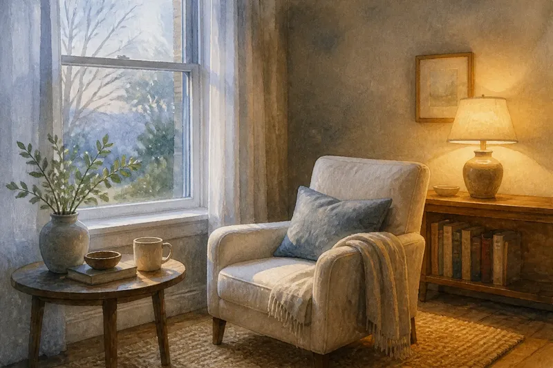
Warm or cool light for a quiet interior photograph is a choice about how the room’s surfaces relate, not simply whether the picture feels cosy or crisp. A pale wall beside a lamp may look creamy under warm light, while the same wall can appear grey-blue beneath cool light; the furniture, shadows and window view shift with it. To choose a consistent mood, begin by noticing which light source is shaping the scene, then decide how its colour should connect the room’s objects.
What makes interior light look warm or cool?
Light has a colour cast: a tint that influences the colours recorded by the camera. Warm light tends towards amber or yellow; cool light leans towards blue. These labels describe appearance rather than temperature you can feel, and neither one is automatically more natural or more attractive.
In a quiet interior, the cast becomes visible through familiar neutrals. White linen can read as cream in warm light and bluish in cool light, while wooden furniture may seem more golden or more subdued. Strongly coloured objects also respond, though their appearance depends on the light falling on them and on surrounding colours.
Direction matters alongside colour. Window light arriving from one side can leave a gentle gradient across a wall, whereas a lamp close to the subject may make a brighter pool with a quicker fall-off into shadow. If the light’s direction already gives the frame a clear structure, its colour can reinforce that structure without requiring extra objects or decoration.
How does each light change the room’s mood?
Warm light often draws attention to wood, woven fabric and softly coloured walls. It can make a still room feel settled and close, particularly when the brightest area falls on a chair, tabletop or folded blanket. The effect is not a fixed emotion: a bare room under amber light may feel subdued rather than inviting.
Cool light can make pale surfaces appear clear and bring out distinctions between whites, greys and muted blues. It may suit a spare interior or a scene where the view through a window is part of the composition. Yet cool light can also make skin tones or warm-coloured objects seem less lively, so check whether the room’s main subject still holds attention.
Think of mood as a relationship between the light and the room, rather than a property of the light alone. A cool window glow on a warm wooden table can create a noticeable contrast; a warm lamp against a cream wall may blend into a quieter range. The useful question is whether that contrast supports the photograph’s subject or competes with it.
Should you use a window, a lamp or both?
Window light offers a broad source whose colour changes with weather, time and the surfaces outside. A lamp gives you a more local pool of light and a practical way to place brightness within the frame. Before adding either source, look at where the existing light lands and which details it leaves in shadow.
- Choose window light when a broad, gentle fall across the room suits the subject and the changing view does not distract.
- Choose a lamp when you want a visible, concentrated glow to define a corner or a surface.
- Combine them when their colour difference feels intentional and the brighter area still leads the eye to the main subject.
Mixed sources can create conflicting casts. A warm bulb illuminating a table may sit beside cool daylight on the wall, giving the same neutral fabric two different appearances. That can add depth, but it can also make the room feel visually divided if the colour boundary cuts through the main subject.
How can you keep the colour mood consistent?
Consistency does not mean removing every colour difference. It means giving the frame a clear dominant light and treating other sources as supporting elements. If daylight is the main source, a lamp can remain visible as a warm accent; if the lamp shapes the subject, daylight can be reduced or allowed to stay in the background.
Look at neutral objects before making a decision. A sheet of white paper, a pale cushion or an unpainted wall can reveal where the light changes from warm to cool. These objects are not perfect colour references, since their own surface and surrounding colours affect how they look, but they help you notice uneven casts within the scene.
Imagine you are photographing a quiet reading chair beside a window, with a warm table lamp behind it. If the chair is the subject, you could let cool daylight illuminate its fabric while the lamp remains a small amber point in the background; the expected result is a distinct subject against a restrained accent. If the lamp’s glow spreads across the chair and wall as well, the warm cast may take over instead, so shifting the chair or turning the lamp away from it could clarify the visual hierarchy.
A camera’s white balance setting changes how it interprets the overall cast. Auto white balance may shift its rendering as the frame changes, while a fixed daylight or tungsten setting gives a more stable starting point for a sequence. These settings cannot make two differently lit parts of a room share one colour; choose a setting that preserves the mood you want, then assess the brightest and most important surfaces on the screen.
What should you check before taking the photograph?
- Find the dominant source. Decide whether the window or lamp gives the subject its main illumination.
- Inspect neutral surfaces. Notice whether the wall, linen or pale furniture changes colour across the frame.
- Check the subject’s colour. Make sure the chosen cast does not hide a useful detail or make the main object blend into its surroundings.
- Watch the light boundary. See whether a warm-cool transition falls across the subject or stays in a less prominent part of the room.
- Set white balance deliberately. Choose a camera setting that supports the intended overall cast, rather than expecting it to correct mixed sources.
- Review the frame as a whole. Check whether the brightest patch and the strongest colour both lead attention towards the same subject.
For camera settings and bulb compatibility, follow the manufacturer’s instructions; if the room’s lighting choices affect a safety matter, consult a qualified professional.
What do photographers ask about warm and cool interiors?
Can warm and cool light appear in the same photograph?
Yes. A warm lamp and cool window light can coexist, and their contrast may help separate a foreground subject from the background. Keep an eye on where the colour boundary falls so it does not distract from the room’s main point of interest.
Should a quiet interior always use warm light?
No. Warm light can create a close, settled impression, but cool light may suit a pale room or a scene whose window view matters. Let the room’s materials and subject guide the choice rather than treating quietness as a fixed colour recipe.
Why does a white wall look different in the same photograph?
Different parts of a wall may receive different sources or amounts of light, and nearby colours can affect how each area appears. A warm lamp on one side and cool daylight on the other can make one surface seem to change colour across the frame.
Can white balance remove mixed-light colour casts?
White balance can shift the camera’s overall rendering, but it cannot independently neutralise every area lit by a different source. If mixed casts undermine the image, change the arrangement or reduce one source rather than relying on a single setting to reconcile them.
How do you make the final choice?
Choose the light that makes the subject easiest to read while preserving the character of the room. Warm light may connect a chair to its wooden surroundings; cool light may distinguish pale fabric from a darker wall. If both have value, let one lead and make the other a contained accent.
Before settling on warm or cool light for a quiet interior photograph, compare the frame’s neutral surfaces, the subject’s colour and the path of the brightest area. The more coherent option is the one whose cast, direction and contrast guide the eye towards the room’s intended detail, even if the colour is not perfectly uniform.